
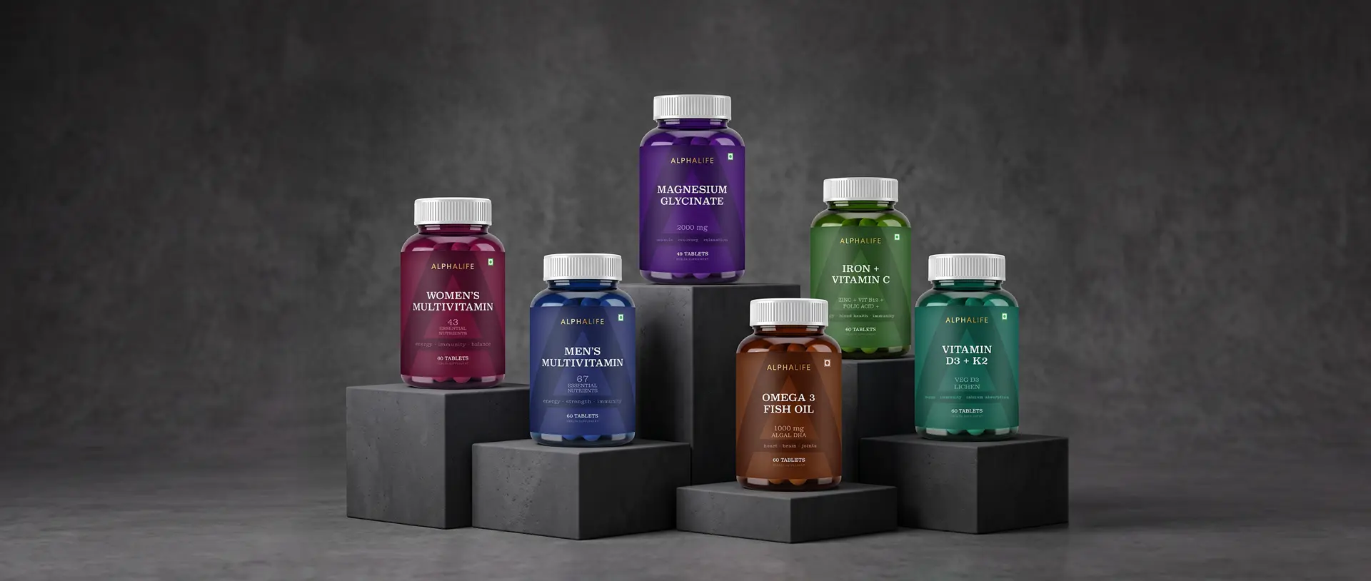
AlphaLife is a growing range of nutritional supplements spanning multiple product needs, from Magnesium Glycinate and Women's Multivitamins to Veg Omega-3 and Vitamin D3 + K2. With the range expanding across products, the challenge was to create a packaging system that could bring the portfolio together while giving each product its own identity.
OUR APPROACH
We approached the range as a portfolio rather than a collection of individual packs. The focus was on creating a clear design architecture that could establish consistency across the range while allowing enough flexibility for each product to stand apart. We explored how the brand's visual language, colour, typography, information hierarchy and graphic elements could work together as one system — one that could continue to grow with the portfolio.
THE IDENTITY
The A became an important part of the visual language. Derived directly from the AlphaLife identity, it creates a recognisable anchor across the range without relying on the logo alone. Its scale, transparency and placement give the packs a distinctive visual signature while allowing colour and typography to shift across different products.
PACKAGING
The packaging system uses colour, typography and information hierarchy to create distinction between products, while the underlying architecture remains consistent. Each pack feels individual, but the range is clearly connected when seen together. The result is a system designed to do what a growing portfolio needs: create recognition without making every pack look the same.