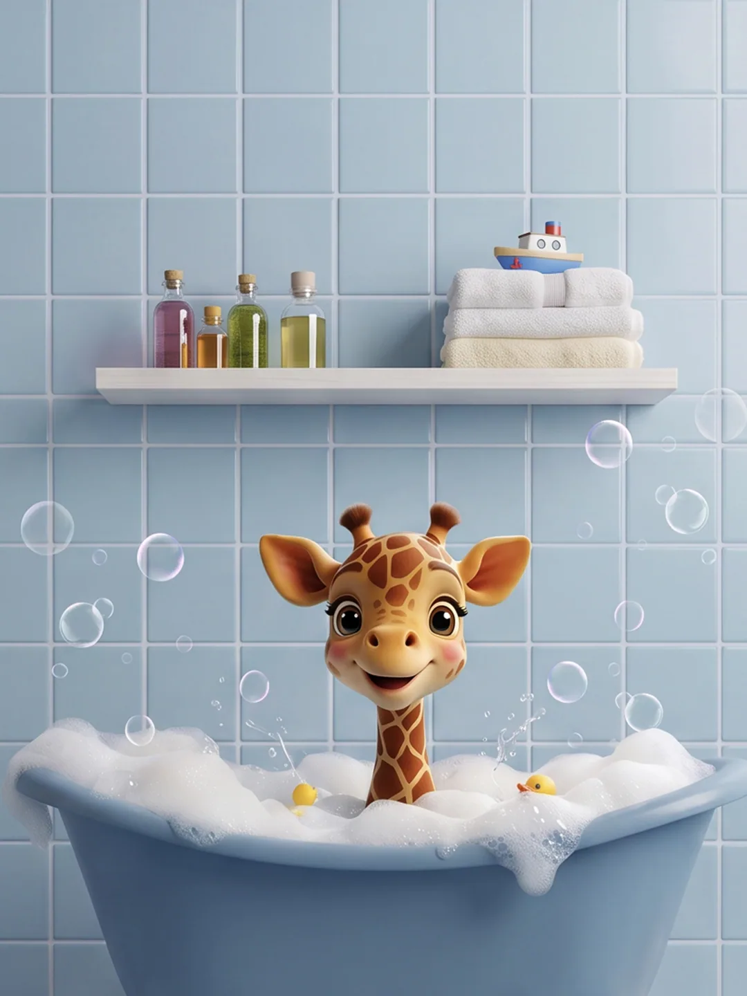

Bath time isn't always a child's favourite part of the day. But what if it could feel less like a routine and more like a little adventure? Happy Bubbles is a children's bath and personal care brand built around this idea. The brief was to create a brand identity and packaging experience that would make everyday bath time more engaging for children while appealing to parents. Our challenge was to translate this simple idea into a brand that felt joyful, imaginative and instantly approachable.
OUR APPROACH
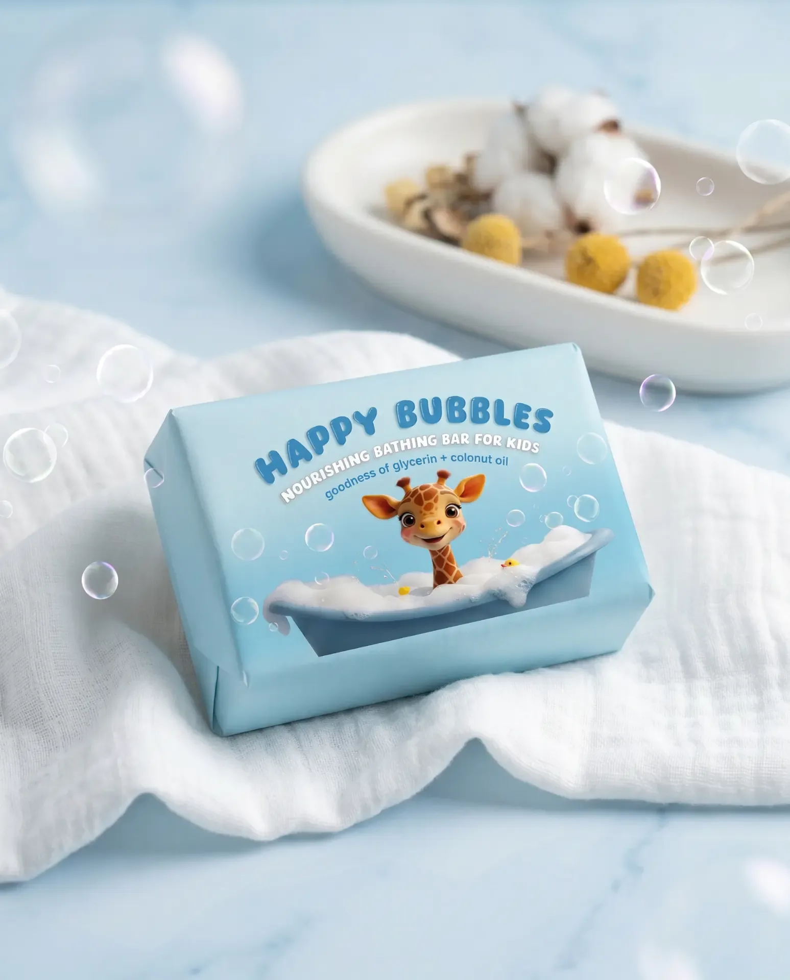
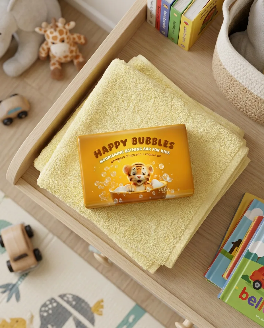
When creating packaging for children's products, there's an interesting balance to strike. Children respond to colour, characters and playful visual cues, while parents are also considering the product, its quality and whether they feel comfortable choosing it for their children. We wanted the packaging to connect with both. Rather than relying on the usual imagery of children, we explored a more imaginative direction using adorable baby animals as the face of the brand. This gave us an opportunity to create a distinctive visual world that children could relate to, recognise and enjoy.
THE NAME & IDENTITY
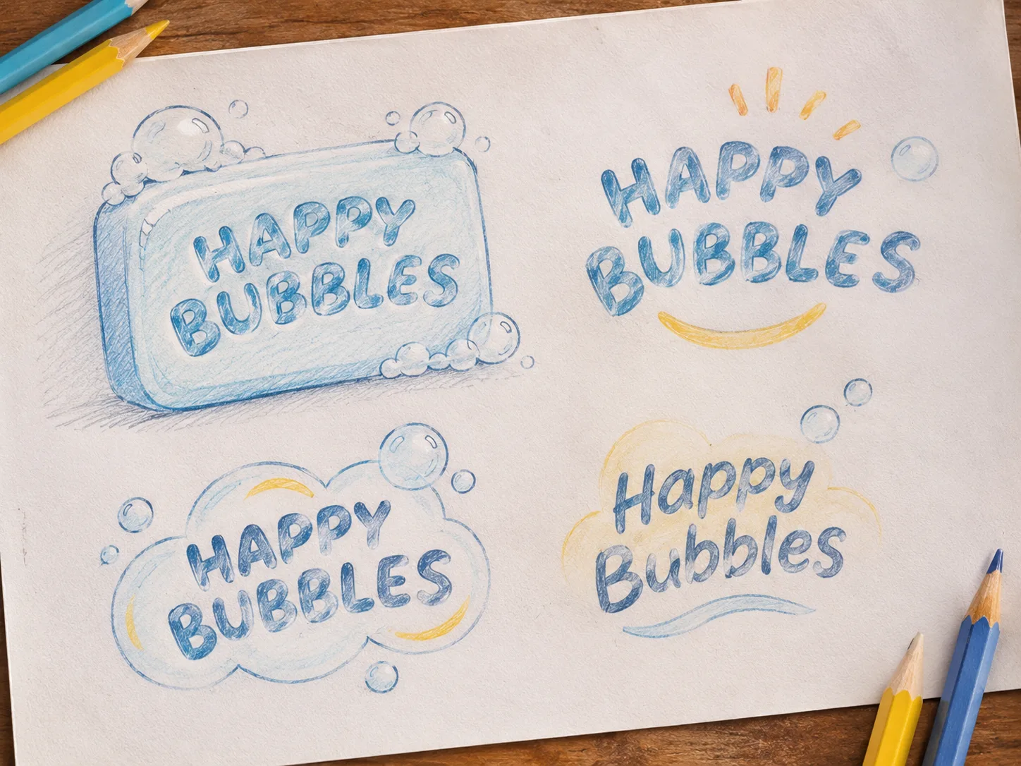
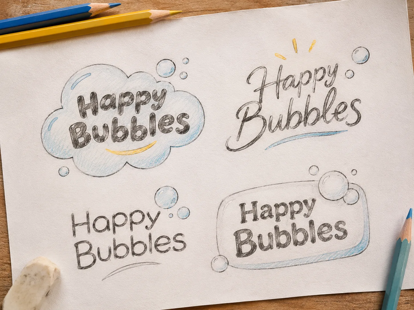
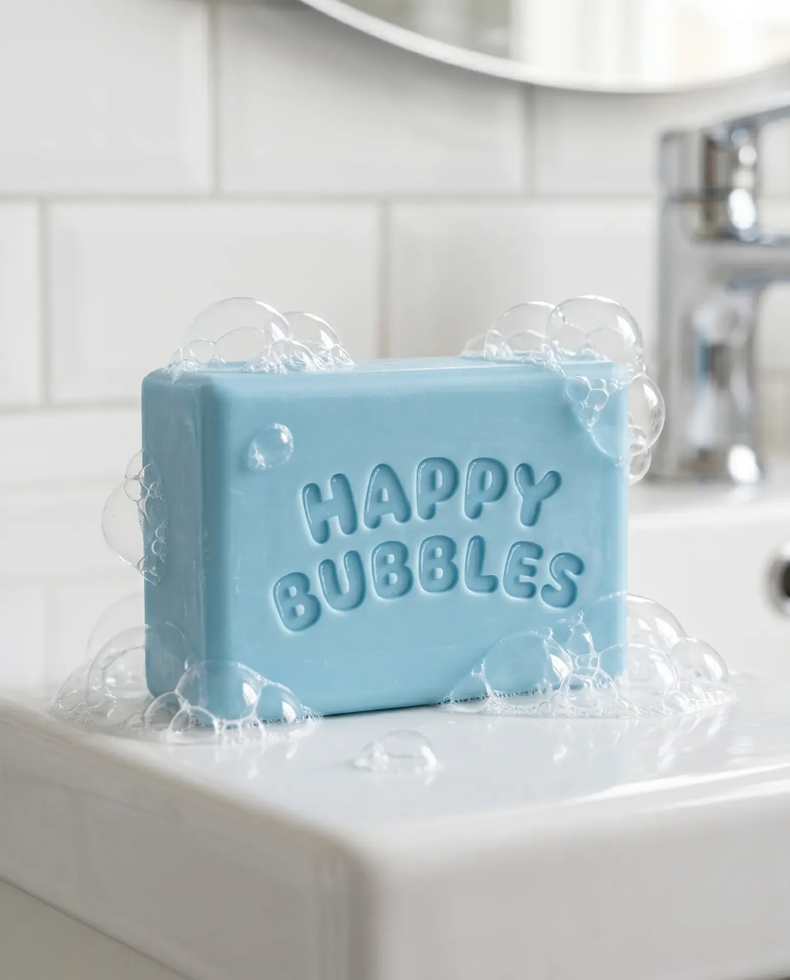
The name Happy Bubbles captures the spirit of the brand. Bubbles bring to mind play, laughter and carefree moments, while Happy expresses the joyful feeling we wanted children to associate with bath time. Together, the two words create a name that is easy to remember, instantly communicates the brand's personality and sets the tone for the entire packaging experience. The visual identity builds on this idea, bringing together vibrant colours and friendly baby animal characters to create a playful and welcoming brand world.
THE PACKAGING
We chose to move away from conventional children's imagery and give the packaging its own little world of baby animals. Each character adds personality to the design, making the packs more engaging and giving children something they can recognise and connect with. The vibrant colour palette and playful illustrations help create visual appeal, while the overall design brings consistency to the brand's presence across its products. The thinking was simple: packaging shouldn't just tell children what the product is. It should make them feel something about it even before they've used it. For a category built around everyday routines, creating that emotional connection can make the experience much more memorable.
THE THINKING BEHIND THE DESIGN
Packaging for children's products has an interesting job to do. It needs to appeal to the child, but it also needs to work for the parent. A character might catch a child's attention, a colour might make a product stand out, and a playful name might make the brand memorable. But the overall packaging still needs to give parents the confidence to consider the product. That's why every visual decision matters. The characters, colours, brand personality and product communication need to work together rather than compete for attention. With Happy Bubbles, we wanted to create an experience that children would be drawn to and parents would feel good about bringing home.
THE OUTCOME
Happy Bubbles brings together a playful brand name, a distinctive cast of baby animal characters and a vibrant packaging language to make everyday bath time feel a little more special. A brand designed to turn an everyday routine into something children can look forward to.