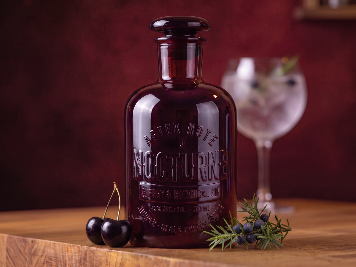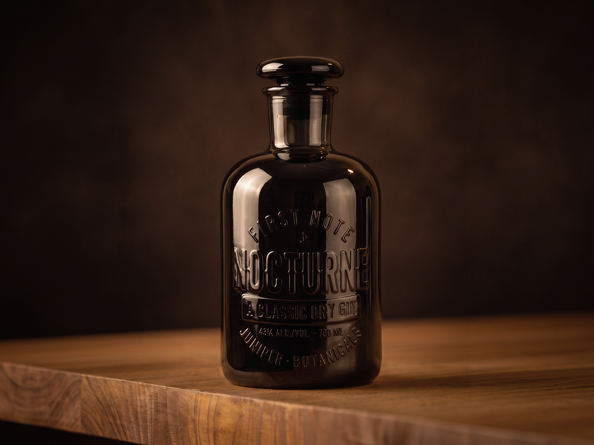
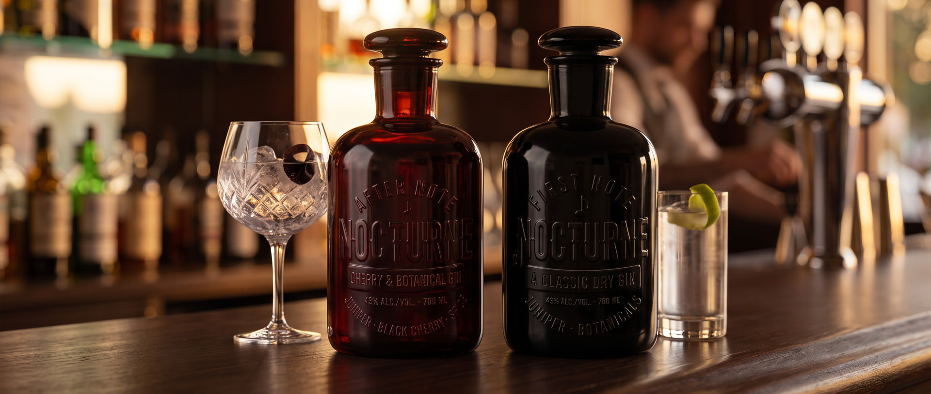
Nocturne is a premium gin built around the idea of the late evening scenes; atmospheric, expressive and made for the moments that unfold after dark. We created the brand from the name outward, building a distinctive narrative through the expressions, First Note and After Note, and translating that idea into a bottle that feels as considered as the gin itself.
OUR APPROACH
We started with the name, Nocturne - a musical form traditionally associated with the night. The name gave us a rich territory to explore: music, mood, rhythm and the unfolding of an evening. From there, we developed a naming system for the two expressions, creating two distinct moments within the same story. The packaging then became an exercise in translating that world into something physical, without relying on conventional decorative labels.
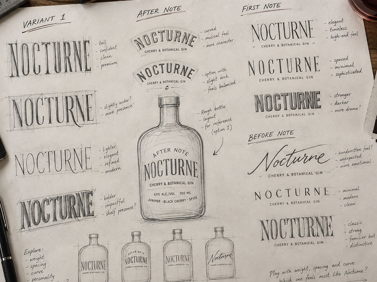
THE IDENTITY
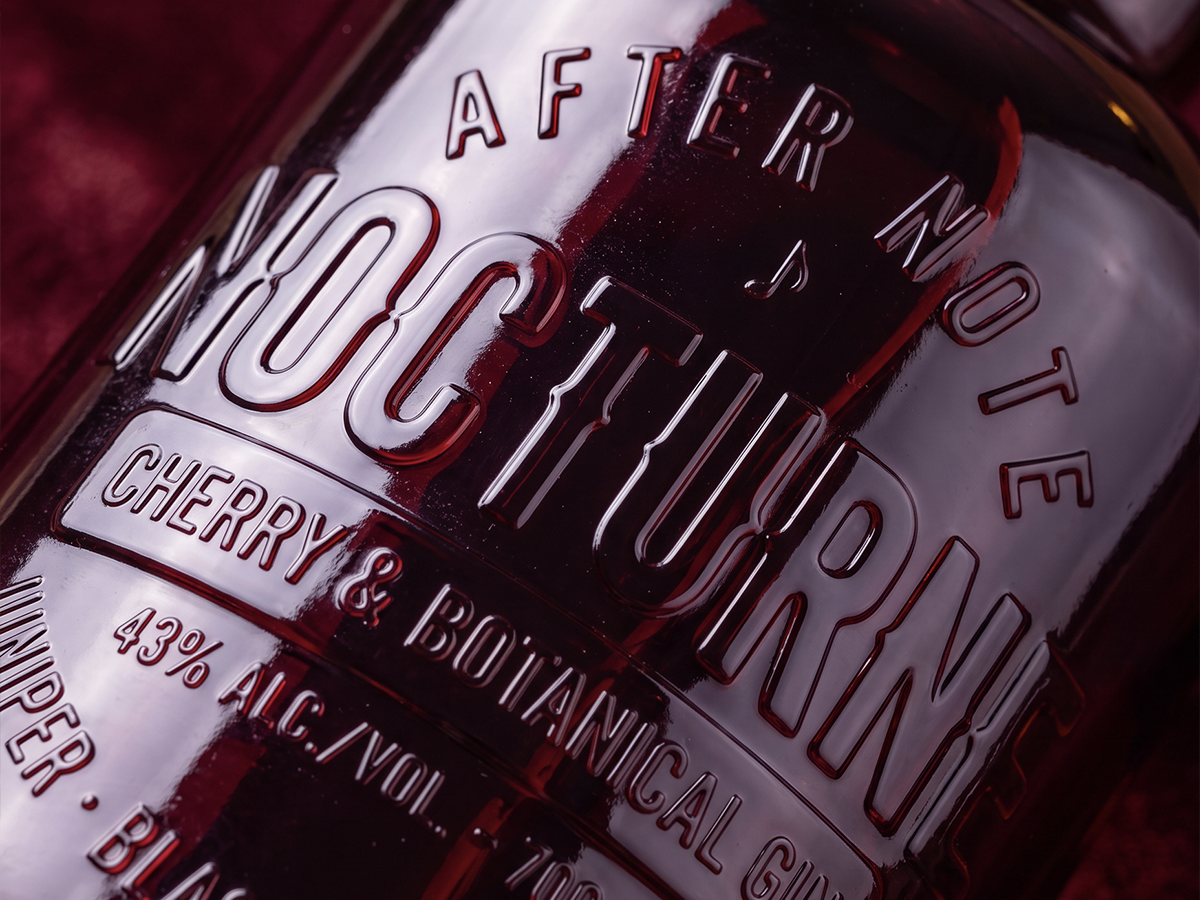
The identity was built around Nocturne and its relationship with music and the night. First Note represents the beginning - the evening opening up, while After Note captures the lingering part of the night, the moment you don't want to end. Together, the names give the range a narrative that extends beyond simply differentiating one gin from another.
PACKAGING
We wanted the bottle to carry the story rather than simply carry a label. Deep-coloured glass and a sculptural silhouette create a sense of depth and intrigue, while musical notation is pressed directly into the glass, bringing the idea of music into the physical experience. The typography follows the form of the bottle, allowing the details to reveal themselves through light and movement. No label. No sticker. Just the bottle carrying the story.