

Little healthy treats. Smarter snacking choices. Smart Snack is a protein snack brand created for consumers who want to enjoy their treats while being more mindful of what they eat. The challenge was to create a brand identity and packaging that communicated its nutritional proposition without taking away from the pleasure of snacking. We wanted the brand to feel approachable, fun and appetising, while making its product benefits easy to understand.
THE NAME & IDENTITY
Smart Snack brings together the idea of making mindful food choices without giving up on the joy of eating. The name is simple, direct and easy to remember. It communicates the brand's proposition while keeping the tone friendly and accessible. The tagline, "Little Healthy Treats," further reinforces this thought, positioning the products as enjoyable treats that fit into a more conscious snacking routine.
THE PACKAGING
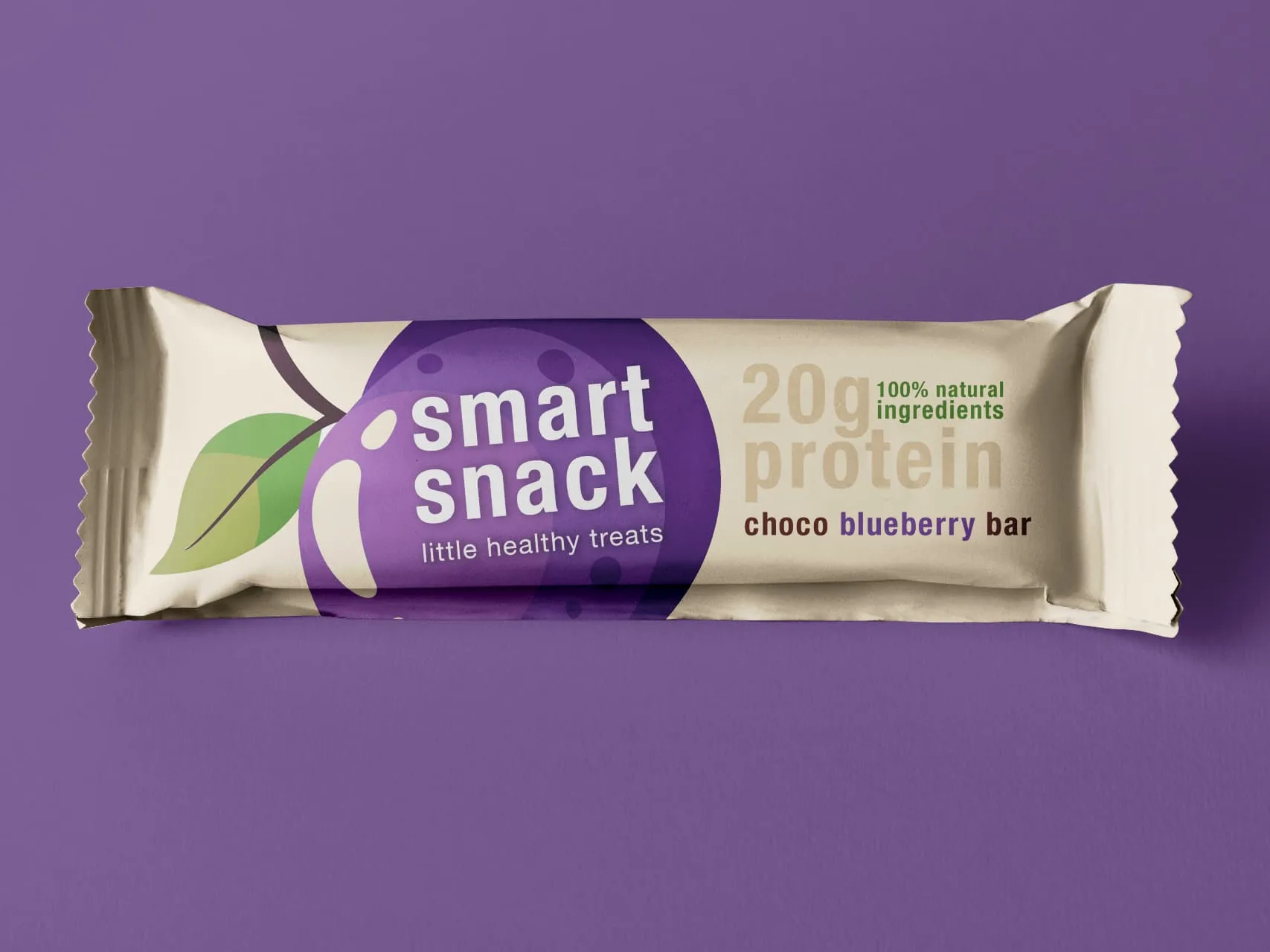
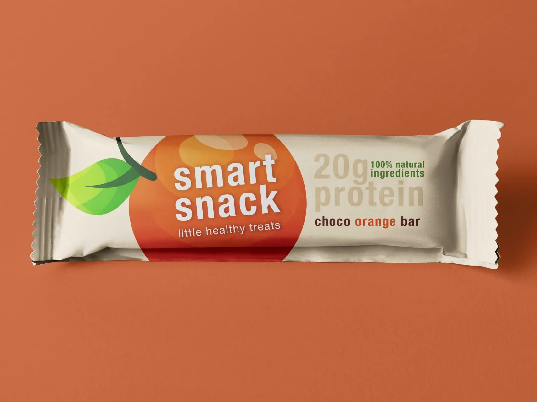
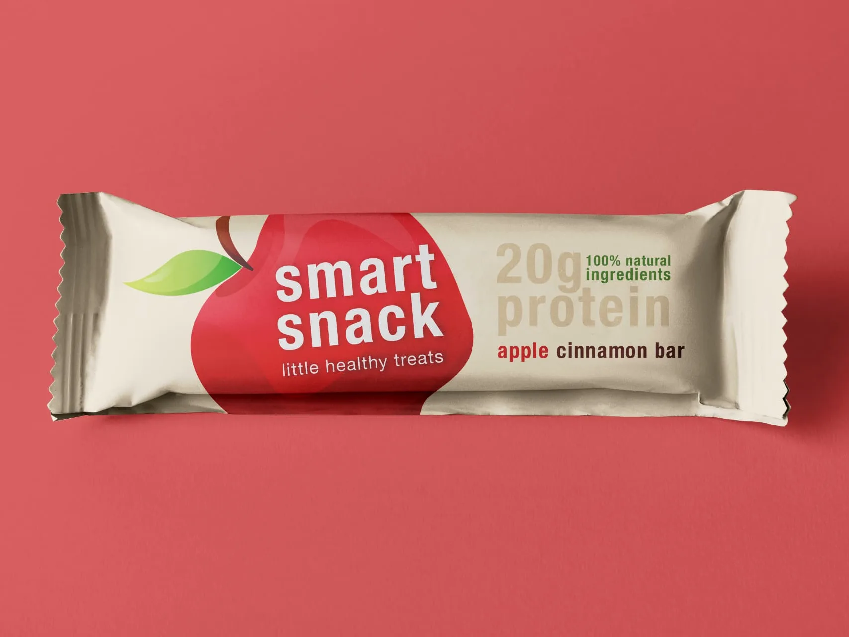
Making healthy snacking look irresistible. We wanted to move away from the conventional visual language often associated with health-focused products and create something more vibrant and inviting. The packaging uses bold fruit-inspired colours and oversized graphic elements to give each flavour its own personality. The large fruit graphics create an immediate visual association with the flavours, while the contrasting colour palette helps distinguish the different variants. At the same time, key product information, including the 20g protein content and natural ingredients claim, is given clear visibility so consumers can quickly understand what the product offers.
THE THINKING BEHIND THE DESIGN
One of the interesting challenges in packaging better-for-you snacks is balancing nutritional communication with appetite appeal. Consumers may be drawn to a product because of its nutritional benefits, but that doesn't mean they want packaging that feels clinical or overly functional. We wanted Smart Snack to communicate both sides of the proposition: a product that makes sense as a mindful choice but still looks like something you'd genuinely want to eat. The result is a visual language that puts flavour and enjoyment at the forefront while keeping the product benefits easy to spot.
THE OUTCOME
A distinctive brand name and a vibrant packaging range that brings together nutritional communication, flavour differentiation and everyday indulgence. Because making a smarter snack choice should still feel like a treat.